Visual identity

Color palette
Using colors appropriately is an easy way to ensure that our materials reflect our brand. Advancement colors include a primary palette of blue and gold tones and a secondary palette with brighter, bolder accents. The secondary palette should never be used alone, nor should it dominate the primary palette. The following are available for your use.
Spot colors are true Pantone® Matching System (PMS) inks used in standard offset printing. Since the type of paper used can affect the ink’s appearance, our palette provides coated and uncoated color swatches — indicated by a C or U following the ink number. Choose the color based on whether you use coated or uncoated paper.
CMYK (cyan, magenta, yellow, black) are the base inks to build the colors specified. They can get very close to PMS inks, but don’t always match. CMYK inks are used in standard offset and digital printing. Note that these CMYK builds will not match the Pantone® Color Bridge breakdowns for the equivalent PMS number. Always use the color values listed.
HEX colors are RGB (red, green, blue) values to build the infinite colors you see on screen. They are only used to view online or digital documents. While everyone’s screens vary, we have made every effort to be as consistent as possible. Note that the HEX colors will not match converted RGB builds, so use the HEX number.
Primary palette

Berkeley Blue
PANTONE 540
C : 100 | M : 55
Y : 0 | K : 55
#003057

California Gold
PANTONE 123 C
PANTONE 109 U
C : 0 | M : 24
Y : 94 | K : 0
#FDB515
Secondary palette

Medalist
PANTONE 7550
C : 0 | M : 34
Y : 98 | K : 12
#C4820E

Oski Gold
PANTONE 139
C : 7 | M : 49
Y : 100 | K : 25
#A57327

Metallic Gold
PANTONE 874
C : 39 | M : 50
Y : 73 | K : 18
#8C704F

Sproul Steps
PANTONE 7542
C : 35 | M : 10
Y : 10 | K : 0
#B0C5CC

Founder's Rock
PANTONE 5405 C
PANTONE 7698 U
C : 70 | M : 33
Y : 22 | K : 20
#4F758B

Stadium Blue
PANTONE 7691 C
PANTONE 3015 U
C : 100 | M : 42
Y : 0 | K : 21
#006298

Lawrence
PANTONE 306
C : 79 | M : 0
Y : 6 | K : 5
#00B0DA

Cal Navy
PANTONE 282
C : 100 | M : 90
Y : 13 | K : 68
#041E42

Sather Gate
PANTONE 558
C : 36 | M : 5
Y : 30 | K : 1
#9ABDAB

Lap Lane
PANTONE 326
C : 86 | M : 0
Y : 41 | K : 51
#00AFAB

Tilden
PANTONE 323 C
PANTONE 322 U
C : 100 | M : 0
Y : 41 | K : 51
#005F61

Ludwig's Fountain
PANTONE 319
C : 52 | M : 0
Y : 19 | K : 0
#20CBD4

Ion
PANTONE 382 C
PANTONE 381 U
C : 25 | M : 0
Y : 98 | K : 0
#C4D600

Soybean
PANTONE 7746
C : 26 | M : 10
Y : 90 | K : 24
#859438

Stone Pine
PANTONE 7498 C
PANTONE 574 U
C : 46 | M : 25
Y : 81 | K : 51
#584F29

Poppy
PANTONE 716
C : 0 | M : 59
Y : 96 | K : 8
#EA7600

Wellman Tile
PANTONE 173
C : 0 | M : 75
Y : 98 | K : 8
#D9661F

Log Cabin
PANTONE 7617 C
PANTONE 497 U
C : 43 | M : 67
Y : 58 | K : 59
#3F3032

The Greek
PANTONE 404
C : 45 | M : 43
Y : 50 | K : 30
#776E64

Pacific
PANTONE 431
C : 20 | M : 6
Y : 0 | K : 70
#5B6770

Peregrine
PANTONE 447
C : 70 | M : 57
Y : 63 | K : 65
#373A36
Color accessibility (contrast)
In accordance with the UC Information Technology Accessibility Policy, and to help serve those with low vision, use only approved color combinations. For websites and other online uses, WebAim Color Contrast Checker is a good tool to measure contrast.
WCAG 2.0 level AA requires a contrast ratio of at least 4.5:1 for normal text and 3:1 for large text. WCAG 2.1 requires a contrast ratio of at least 3:1 for graphics and user interface components (such as form input borders).
Large text is defined as 14 point (typically 18.66px) and bold or larger, or 18 point (typically 24px) or larger.
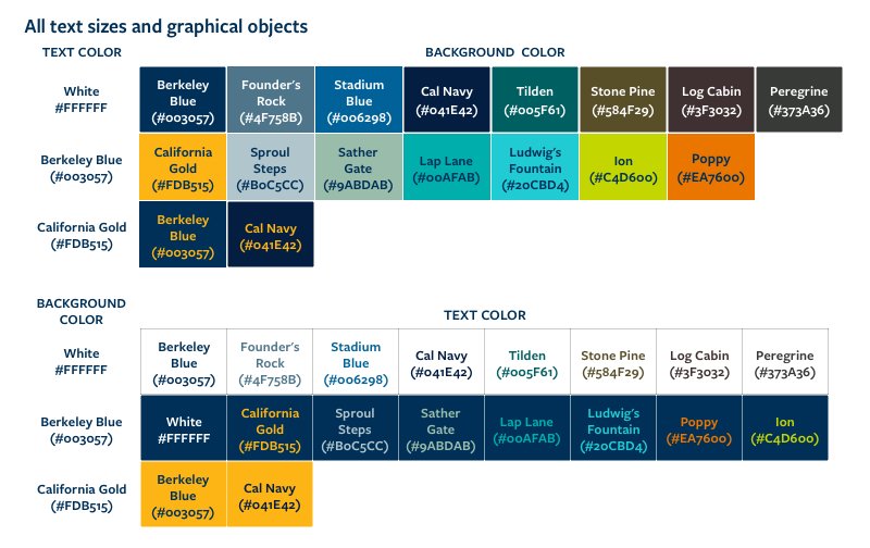
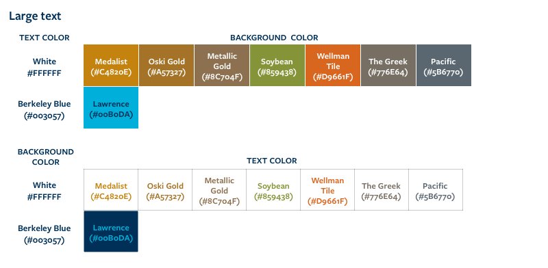
These color combinations meet accessibility standards. When choosing typography and background colors, always promote visibility and legibility by ensuring sufficient contrast. Avoid using color as the only way to differentiate information, such as in graphics. Guidelines for accessibility are available via our Digital Accessibility Program (DAP).